The past couple of fashion seasons, I’ve noticed the trend of pairing neutrals or murky tertiaries with a slice (or in some daring examples, a chunk) of neon, usually orange, magenta, or electric blue. Though it’s absolutely surprising– some might even say shocking– this is not actually a new 21st century invention. Many think of the Victorian era as swathed in somber black (thanks to Queen Victoria’s permanent state of mourning for her beloved Alfred), it was during this period that synthetic dyes were invented (mauvine, or “mauve” was the first), and people went color crazy, pairing wildly contrasting colors together in a riot of mismatching patterns.
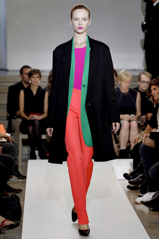
This is clearly evidenced in fashion and also interior design of the mid-late 19th century, as in the vivid wallpaper and upholstery prints of William Morris and C.F.A. Voysey, which bears an uncanny resemblance to Jil Sander’s recent collection:
I really disliked this Preen color combination when I first saw it, but I gotta tell ya, it’s grown on me, a lot:
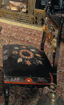
And it seems to me it’s not so far off from the upholstery of the Moorish Smoking Room in the Worsham-Rockefeller House, circa 1881, which pairs subdued charcoal with an almost identical flaming orange:
The strip of psychedelic tangerine on Prada’s soles is certainly jarring and seems terribly cutting edge…
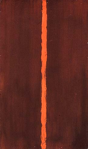
as it was way back in 1948 when Barnett Newman made his very first “zip” painting, Onement I, a gloriously imperfect stripe of vivid orange that cleaves the mottled maroon and makes each color seem brighter and more muted, respectively, for being put in such close proximity:
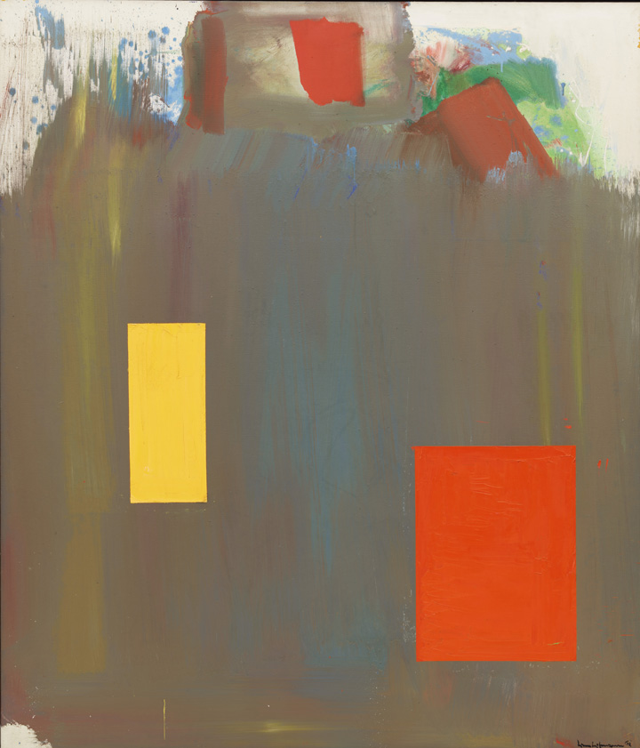
Also featured in MoMA’s excellent exhibition Abstract Expressionist New York, Hans Hofmann’s Memoria in Aeternum similarly punctuates muted, kinda pukey tones with crisp, sunny orange and yellow rectangles:
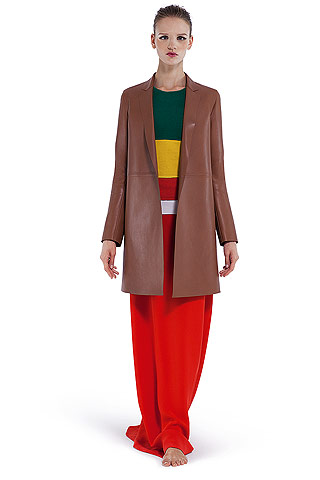
Baly’s ensembles reflected some of this one, complete with rectangle motif. Again, it’s the juxtaposition with a muted neutral that gives real oomph to already bright colors, lending them a truly futuristic, glowing appearance:
The color theorist Josef Albers (1888 – 1976) influenced the Abstract Expressionists with his awesomely fun and interesting book Interaction of Color (1963), as well as his own paintings. Interested in how the perception of colors change when adjacent to other colors, he favored simple shapes– usually squares– to demonstrate this point (if you click on the image below, the red practically pulses):
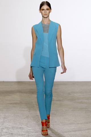
You get a similar feeling of being unsettled if you look too long at this outfit, yes?:
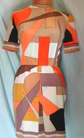
Albers and the Abstract Expressionists transitioned into the psychedelic colors of the 1960s, facilitated by the next generation of bright dyes. Emilio Pucci (1914 – 1992) revolutionized popular fashion with his flamboyantly vibrant prints and high contrast paletes. Margaret Walch and Augustine Hope note in their marvelous book Living Colors: The Definitive Guide to Color Palettes Through the Ages (which, my roommates will remember, I used to fall asleep on the couch with), “To capture some of the explosive energy of a Lichtenstein or Warhol canvas, pinks were swirled alongside ocher yellows, blues were combined with browns, and greens with corals.” Again, fashion and art intersected. The example below is actually more geometric and less trippy/swirly than most Pucci’s, but there is that vivid tangerine again, surrounded by floating blocks of earthier tones:
I have to say, when I saw the proliferation of these oranges coming down so many runways last season, I was not a fan. But staring at them for long periods of time practically hypnotizes you– not only do I see similar examples everywhere I look these days (films, paintings, posters, etc.), they’re actually growing on me…! The question I still have, I suppose, is: what drives these artists / designers to embrace what many would agree is, at least for the first moment, an eyesore, something that unsettles, that shocks, that somehow seems wrong? The follow-up question would be: what attracts simple consumers to the same?







1 comment
cervixosaurus says:
Mar 4, 2011
Wow I love your juxtapositions of clothes and art, they are all really well selected.